Google Calendar is not the only Google services that has recently updated the favicon: Google Sites and Google Translate have new shortcut icons and it's likely that many other Google sites will use the colorful images from this page.
{ Thanks, James, Bastian, Matt, Lasse, Gamer and Neil. }

Sites’ icon is not clear.
ReplyDeleteCould this me a sign that something big's going to happen next Tuesday, the 31st? Please let it be better Gmail and Cal integration.
ReplyDeleteDoes it mean that starting today, every day will be the 31st ? Serously, favicon should be changed everyday to match the date. Maybe a firefox/chrome extension can do that.
ReplyDelete@Anoymous:
ReplyDeleteBrowsers usually cache favicons, so I don't think it's easy to change the favicon every day.
Agreed, using the 31st as a static favicon is a poor choice. Either stick with a monthly calendar icon or have the icon change to the current day. The current setup is going to confuse users for 98% of the month.
ReplyDelete@Alex Chitu
ReplyDeleteJavascript is able to change the favicon dynamically, so the cache problem should lessen (ie mainly bookmarks should be impacted, not tabs).
I'm not a fan of the new site and calendar changes.
ReplyDeleteToday is not the 31st.
And for sites, what am I looking at?
I agree that the favicon change was a bad choice. The only useful thing I can think of is that the icon changes monthly to indicate the number of days in the month. That could be helpful... keyword: could
ReplyDeleteJust realized with the calendar. Don't forget the quick tour.
ReplyDeleteIt should be possible...
ReplyDeletehttp://userscripts.org/scripts/show/24430
... and it would actually make a great improvement.
Cheers
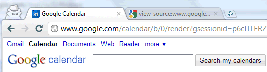
I noticed the new Calendar favicon this morning. I saw it before, a few days ago, in a Google Apps ad. Translate also got a new favicon, too (before it use to use Google favicon).
ReplyDeleteI'm not sure if I like or dislike the new Calendar favicon, but I know it's way better than the Google favicon. That thing is awful!
Why not use the Calendar's icon that is used on the Chrome Google Calendar App?
ReplyDeleteIt is a little modern, and still has the Google Calendar look!
I believe the cached favicon can be overridden by generating a random number to place after the favicon URL. This will force the user to download a new favicon each time the page loads.
ReplyDeletee.g. [link href='/favicon.ico?[?php echo rand(1,10000); ?]' rel='shortcut icon'/]
For anyone interested in applying this technique on their own site. :)
Of course, they could always just do something like "favicon8.ico" for the 8th of the month, "favicon31.ico" for the 31st, etc.
When will they put an unique one for Google Maps !?
ReplyDeleteFinally google getting some favicons xD
ReplyDeleteBut Maps, iGoogle, Dashboard still missing favicons :)
Ugh, I noticed the new icon this morning - it's horrid! A flat blue square doesn't fit in at all with Google's other favicons in my tabs, and having it permanently say the 31st is completely daft. I do hope that this is a temporary thing, and that it will change after whatever exciting thing is meant to happen on the 31st. How very silly...
ReplyDeleteReally, really ugly. I can't even tell what it's supposed to be.
ReplyDeleteI really hate the new icon. I was originally really confused that it was the 31st already (losing a whole week somehow).
ReplyDeleteNow it doesn't even match the gmail and reader tabs that i have opened next to it.
Bluck. I really dislike that favicon, sorry to say. Can I have the old one back, as a lab feature maybe?
ReplyDeleteTerrible. The old one was way better. Makes me fel like I need to refresh the page because the date is wrong.
ReplyDeleteThose new favicons look like 1990's, sorry to say. Just ugly.
ReplyDeleteThis updated my taskbar app shortcut in Windows 7 yesterday. Looks terrible with a big "31" down there. Also, it's low-res in the taskbar whereas the Gmail taskbar app shortcut is hi-res.
ReplyDeleteAnd agree on the comments about it being one particular date. Stupid.
I second everyone else, the new icon is ugly and hard to recognize, wrong day. Bring the old one back
ReplyDeleteI also think it's just ugly...
ReplyDeletedo not like the new favicon. it doesn't "go" with the rest of the google brand favicons and so i have to look harder for it in my toolbar. do not like.
ReplyDeleteThis is really annoying. I saw the 31 and thought I lost 7 days. Did I submit my TV show, have dinner with my Mom? I couldn't remember. Thankfully it was just someones bad idea for a favicon.
ReplyDelete+1 Ugly.
ReplyDeleteGoogle - Please make all future favicons hi-res, like the current gmail and reader favicons.
I second John's comment: if you do it as a single date, better change it every day. Really though, I think you're best leaving it as a monthly, since (1) the user won't always think "it's the 31st?" (when it's really the 30th, or the 1st) and (2) the favicon will not be dynamic (like a daily-rotating one would), meaning the user can adjust to "that icon == my calendar".
ReplyDeleteRevert please?
The new favicon obtrudes questions why it's 31st displayed.
ReplyDeleteIt'd be better displaying old favicon :-x
Google Calendar... now Google Reader... yet another example of "change for the sake of change"--wouldn't want those users getting "comfortable" with their apps after all. (Just another part of the "Look at me! Look at me!" mentality that Google seems to be adopting now. It just makes me so... disenchanted, with all Google apps, and Google as a whole. And then there's "Goo-rizon-gate".)
ReplyDeleteI think Google should adopt a unified look for all its app's favicons. Right now I have favicons for Mail, Reader, Calendar, Documents, and Wave (yes, Wave) in my toolbar, and they all look like apps from a different company.
ReplyDelete